Documentation Index
Fetch the complete documentation index at: https://docs.moodmnky.com/llms.txt
Use this file to discover all available pages before exploring further.
Design Guidelines
Brand Visual Language
The MOOD MNKY visual language combines organic sensory elements with clean modern design to create experiences that feel both premium and approachable. Our design approach balances:Organic & Precise
Fluid, natural elements paired with intentional structure and clarity
Sensory & Digital
Tactile, rich textures combined with clean interface elements
Warm & Clear
Inviting, emotional qualities with purposeful communication
Color System
MOOD MNKY uses a clean, monochromatic color palette that reflects our sophisticated, minimal aesthetic and allows our content to take center stage.
Primary Color Palette
Pure Black
#000000
Dark Charcoal
#1E1E1E
Medium Gray
#333333
Silver Gray
#CCCCCC
Our monochromatic palette provides a sophisticated foundation that ensures consistency across all touchpoints while allowing our imagery and content to shine.
Color Usage Guidelines
- Pure Black (#000000): Primary brand color, used for backgrounds, logos in light mode, and key UI elements.
- Dark Charcoal (#1E1E1E): Used for secondary backgrounds, form elements, and to create depth in dark mode.
- Medium Gray (#333333): Used for text, borders, and subtle UI elements.
- Silver Gray (#CCCCCC): Used for accents, highlights, and to create contrast in dark environments.
White (#FFFFFF) is used as a background color in light mode and for text and UI elements in dark mode.
Typography
Our typography system is clean, legible, and timeless, emphasizing clarity and readability across all platforms.
Primary Font: Inter
Inter Bold
Used for headings and emphasis
Inter Medium
Used for subheadings and UI elements
Inter Regular
Used for body text and general content
Secondary Font: Satoshi
Satoshi Bold
Used for feature headings and displays
Satoshi Medium
Used for feature subheadings
Satoshi Regular
Used for specialized content
Font Hierarchy
H1: Inter Bold 30px
Used for page titles and major section headings
H2: Inter Bold 24px
Used for section headings
H3: Inter Bold 20px
Used for subsection headings
H4: Inter Medium 18px
Used for minor headings and emphasized content
Body: Inter Regular 16px
Used for general content and body text
Small: Inter Regular 14px
Used for secondary text, captions, and UI elements
Consistent typography helps maintain brand recognition and ensures readability across all devices and platforms.
Iconography
Our iconography system uses simple, clean lines with a consistent stroke weight. Icons should be recognizable at a glance while maintaining a minimalist aesthetic that complements our monochromatic palette.
Icon Guidelines
- Maintain consistent 2px stroke weight for outline icons
- Use 24x24px as the base size with clear padding
- Ensure icons are legible at small sizes (16x16px minimum)
- Follow our grid system for proper alignment
- Use our monochromatic color palette
Usage Contexts
Icons should be used consistently across our platforms to reinforce meaning and improve usability.
Imagery & Photography
Our visual content prioritizes a minimalist monochromatic aesthetic with strategic color accents. Images should evoke emotion and enhance the brand narrative while maintaining visual consistency.
Photography Style
We use high-contrast, clean imagery with a focus on texture, form, and subtle details. Our photography style follows these principles:
- Embrace negative space to create focus and breathing room
- Use dramatic lighting to create depth and dimension
- Incorporate texture and contrast to add visual interest
- Maintain a consistent monochromatic edit across imagery
- Use intentional composition with thoughtful framing
Image Categories
Product Photography
Clean, minimal product shots with emphasis on texture and detail. Always shot against neutral backgrounds.
Lifestyle Imagery
Authentic moments that convey mood and emotion, edited with a consistent monochromatic treatment.
Abstract Elements
Textural, atmospheric imagery that conveys scent and emotion through abstract visual language.
Image Treatment Guidelines
High Contrast
Soft Gradient
Focal Point
When editing images, maintain consistent contrast levels and tonal ranges. Ensure that all imagery feels part of the same visual family while allowing for appropriate variation based on subject matter and usage context.
UI Components
Core Components
Buttons
Cards
Card content with information and possibly actions at the bottom.
Form Elements
For a complete component library, refer to the UI Component Documentation in our design system.
Layout & Spacing
Grid System
We use a 12-column responsive grid system with consistent gutters. This provides flexibility while maintaining structural consistency across different screen sizes.
12-column grid example
Spacing Scale
We use a consistent spacing scale based on 4px increments. This creates rhythm and harmony throughout our interfaces.
Animation & Interaction
Motion Principles
Our animations are subtle, purposeful, and help guide users through their journey. We focus on smooth transitions that enhance the experience without causing distraction.
Interactive States
Clear visual feedback helps users understand when elements are interactive and how they respond to actions.
Brand Assets
Logo Usage
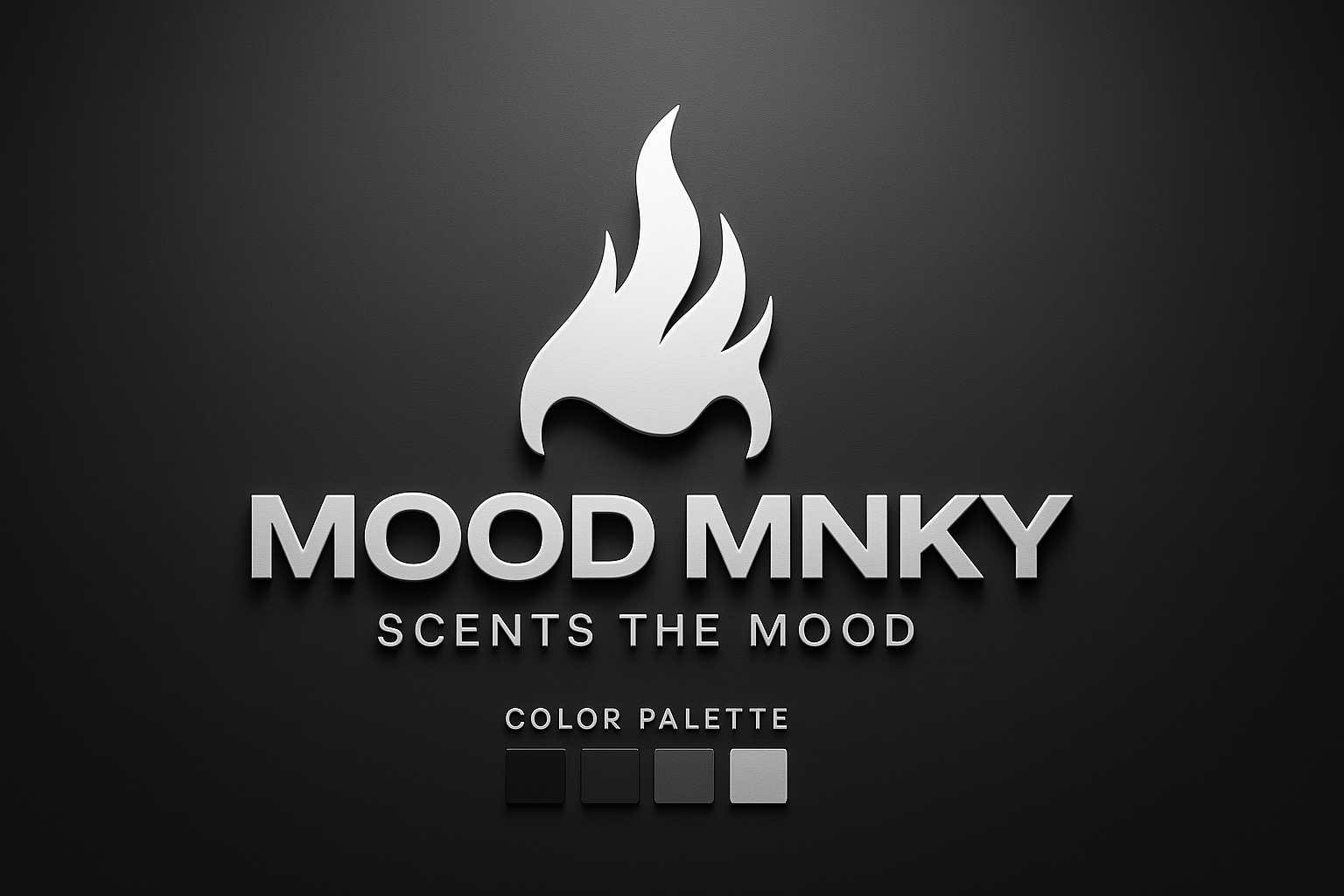
The MOOD MNKY logo consists of our wordmark and can be used with or without our symbol, depending on the application.
Primary (Full Color)
Monochrome
Symbol Only
Maintain clear space around the logo equal to the height of the “M” in MNKY to ensure visual impact.
For print: 1 inch wide minimum.
For digital: 100px wide minimum.
Agent-Specific Design
While our primary brand uses a monochromatic palette, each of our specialized AI agents has a distinct visual identity that incorporates subtle color accents into our core palette:
MOOD MNKY Agent
Uses our core monochromatic palette with subtle hints of warm gray tones and organic, flowing shapes that evoke emotional intelligence.
CODE MNKY Agent
Maintains the monochromatic palette with cooler gray tones and more structured, precise geometric shapes reflecting technical expertise.
SAGE MNKY Agent
Works within the monochromatic palette with neutral gray tones and pattern variations reflecting knowledge, growth, and nurturing guidance.
For detailed guidelines on agent-specific design, see the Agent Styling Guide.
Implementation Guide
For Digital Products
When implementing these guidelines in digital products:
- Use the UI component library for consistent implementation
- Follow responsive design principles for all screen sizes
- Maintain accessibility standards (WCAG AA minimum)
- Consider dark mode implementation using our color system
- Test interactions across devices and input methods
For Physical Products
When implementing these guidelines in physical products:
- Select materials that reflect our tactile brand qualities
- Ensure color accuracy across different materials
- Consider environmental factors in production choices
- Maintain consistent typography across packaging
- Create cohesion between digital and physical touchpoints
Resources & Tools
Design System
Asset Library
Templates
Related Resources
- Brand Bible for comprehensive brand guidelines
- Agent Styling Guide for agent-specific design standards
- Team Lore for the cultural context of our design approach