Documentation Index
Fetch the complete documentation index at: https://docs.moodmnky.com/llms.txt
Use this file to discover all available pages before exploring further.
Brand Bible
Brand Essence
MOOD MNKY transforms self-care into a journey of personalized discovery through multi-sensory experiences that adapt to individual needs and foster authentic connection.
Core Attributes
Authentic
We embrace genuine expression over curated perfection, creating spaces where people can be their true selves without judgment or pretense.
Exploratory
We approach every interaction with curiosity, embracing discovery and encouraging both ourselves and our community to venture beyond comfort zones.
Adaptive
We create experiences that respond to individual contexts and evolve over time, recognizing that personalization requires continuous learning and adjustment.
Brand Voice
Tone Attributes
We Are
- ✓Warm
Our communication feels like a conversation with a trusted friend—approachable, caring, and genuinely interested.
- ✓Thoughtful
We communicate with intention and depth, avoiding superficial platitudes in favor of meaningful insights.
- ✓Clear
We express complex ideas in accessible language, making our communication inclusive and understandable.
- ✓Nuanced
We recognize complexity and avoid binary thinking, embracing the richness found in the spaces between extremes.
We Are Not
- ✗Trendy
We don’t chase fleeting wellness fads or rely on buzzwords that will quickly become dated.
- ✗Prescriptive
We don’t position ourselves as the singular authority telling people the “right way” to practice self-care.
- ✗Corporate
We avoid stiff, formal language that creates distance and instead opt for authentic human connection.
- ✗Overpromising
We don’t make grandiose claims about instant transformation or perfect results.
Writing Guidelines
Vocabulary and Language Choices
Vocabulary and Language Choices
Use these terms to maintain consistency and reinforce our brand identity:
- Members (not customers or users) for those in our community
- Experience (not product) when referring to what we create
- Journey (not program or routine) for the process of personal development
- Discover (not learn or study) for knowledge acquisition
- Create or blend (not make or produce) for the act of making something new
Incorporate language that evokes the senses to create more immersive communication:
- Reference specific sensory qualities rather than generic descriptions
- Use synesthetic descriptions that cross sensory boundaries
- Include specific details that evoke sensory memory
Vary sentence structure to create rhythm and maintain engagement:
- Mix short, impactful sentences with more flowing, descriptive ones
- Use active voice predominantly, with passive voice only for specific emphasis
- Address the reader directly to create conversation and connection
Content Principles
Content Principles
Structure content as meaningful narratives rather than collections of facts. Include specific details, emotional context, and a clear perspective. Every piece of content should have a beginning, middle, and end—even short-form communications.
Create content that acknowledges diverse experiences and avoids assumptions. Use inclusive language that welcomes people of all backgrounds. Review content to ensure it doesn’t inadvertently exclude or stereotype any groups.
Recognize the emotional landscape around topics we address. Acknowledge challenges and difficulties alongside positive outcomes. Avoid toxic positivity that dismisses genuine struggles in favor of forced optimism.
Create content that inspires without setting unrealistic expectations. Balance aspirational messaging with authentic acknowledgment of the complexities involved. Show the journey, including both progress and setbacks.
Visual Identity
Color System
Primary Palette
Deep Charcoal Black
#131313
Carbon Gray
#1E1E1E
Dark Graphite
#2B2B2B
Slate Gray
#3C3C3C
Soft Silver Gray
#B0B0B0
Secondary Palette
Pure Black
#000000
Medium Gray
#333333
Stone Gray
#666666
Light Gray
#CCCCCC
Pure White
#FFFFFF
Color Usage Guidelines
- Deep Charcoal Black (#131313): Main background, logo base
- Carbon Gray (#1E1E1E): Secondary backgrounds, UI container elements
- Dark Graphite (#2B2B2B): Interactive elements, dividers
- Slate Gray (#3C3C3C): Text, icons, secondary elements
- Soft Silver Gray (#B0B0B0): Accents, highlights, UI elements
- Use Deep Charcoal Black with Soft Silver Gray for primary UI elements
- Layer colors within the palette to create depth and visual hierarchy
- Pure White text on dark backgrounds for maximum readability
- Maintain sufficient contrast for accessibility (WCAG AA minimum)
- Use colors consistently to reinforce brand recognition
Typography
Primary Typefaces
Inter
Aa Bb Cc 123
Primary sans-serif font for all body text, UI elements, and general content
Fraunces
Aa Bb Cc 123
Serif font for headlines, key statements, and narrative elements
Type Scale
Display
72px Fraunces
Heading 1
48px Fraunces
Heading 2
36px Fraunces
Heading 3
24px Inter Bold
Body
16px Inter Regular
Small/Caption
14px Inter Regular
Logo Usage
Logo Variations
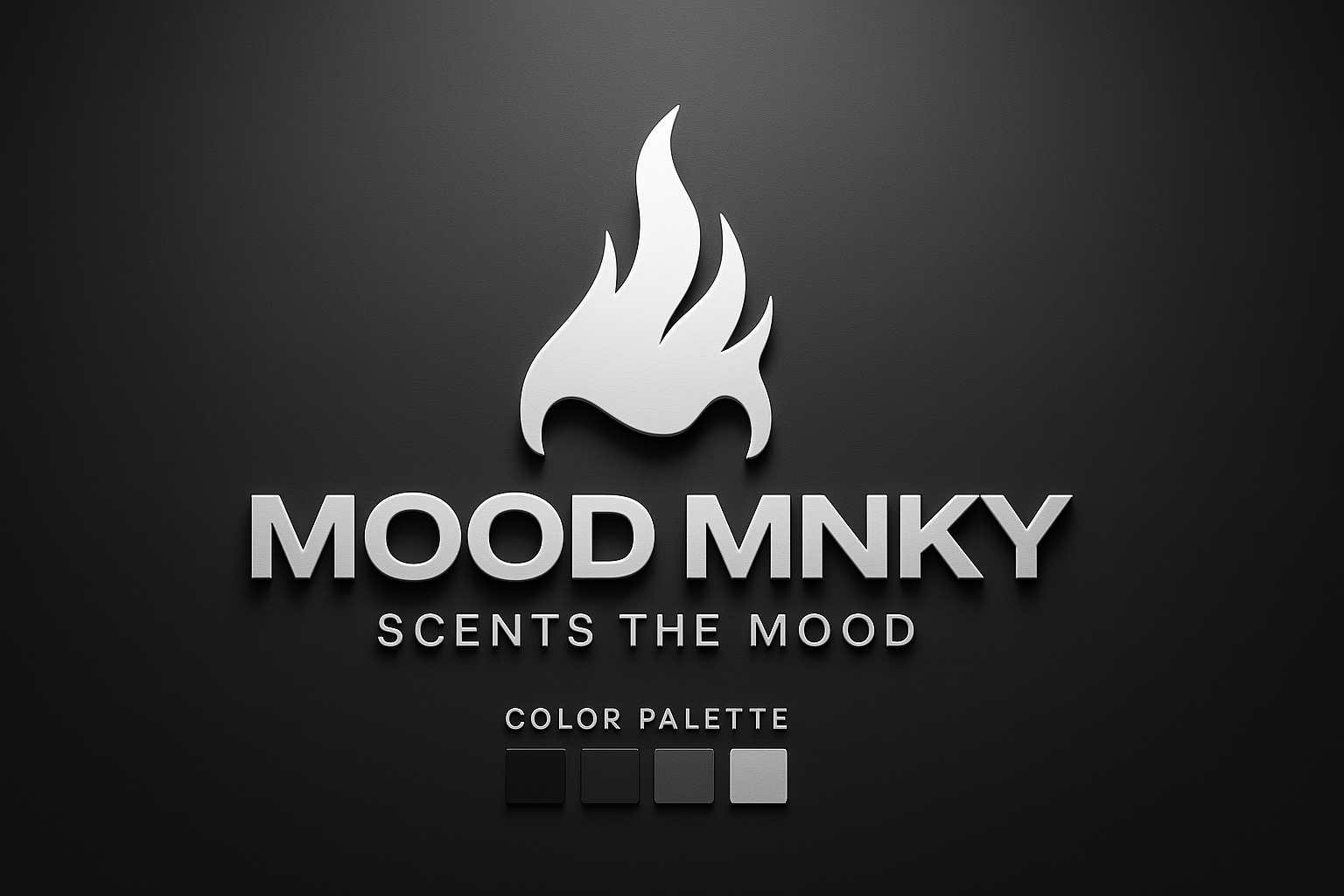
The MOOD MNKY logo consists of our wordmark and can be used with or without our symbol, depending on the application.
Primary (Full Color)
Monochrome
Symbol Only
Maintain clear space around the logo equal to the height of the “M” in MNKY to ensure visual impact. Never crowd the logo with other elements.
For print: 1 inch (25.4mm) wide for the full logo, 0.5 inch (12.7mm) for the symbol only.
For digital: 100px wide for the full logo, 50px for the symbol only.
Imagery Style
Photography
Our photography style is characterized by natural lighting, authentic moments, and rich sensory detail. Images should evoke a sense of genuine experience rather than staged perfection.
Photography Example
Illustrations
Our illustrations use organic shapes, fluid lines, and a balance of abstraction and representation. They should feel handcrafted rather than purely digital.
Illustration Example
Textures
Incorporate subtle textures that evoke tactile sensations. These add depth and sensory richness to our visual language without overwhelming the content.
Texture Example
Brand Applications
Digital Experience
Interface Principles
Spatial Metaphor
Design interfaces that evoke a sense of physical space and movement, helping users form mental models that bridge digital and physical experiences.
Sensory Feedback
Incorporate meaningful visual, auditory, and (where possible) haptic feedback that reinforces interactions and creates a richer experience.
Progressive Disclosure
Reveal information and options gradually, creating a sense of discovery and preventing overwhelming cognitive load.
Adaptive Context
Design interfaces that respond intelligently to user behavior, time of day, location, and other contextual factors.
Physical Products
Product Design Principles
Tactile Quality
Create physical products with intentional tactile qualities that engage the sense of touch and create memorable interactions.
Visual Continuity
Maintain visual continuity between product, packaging, and digital touchpoints to create a cohesive experience across the customer journey.
Functional Beauty
Design products where aesthetic beauty and functional effectiveness are in harmony, avoiding purely decorative elements.
Sensory Narrative
Structure product experiences as sensory narratives with a beginning, middle, and end that unfold over time.
Environmental Design
Space Design Principles
Sensory Zoning
Design spaces with intentional sensory zones that create different atmospheric experiences while maintaining overall cohesion.
Natural Elements
Incorporate natural materials, light, and biophilic elements to create environments that feel connected to the natural world.
Adaptive Environments
Create spaces that can transform based on needs, time of day, and activities to support different modes of experience.
Transitional Moments
Design meaningful transitions between spaces that prepare people for shifts in experience and create a sense of journey.
Brand Architecture
Ecosystem Structure
| Brand Entity | Description | Visual Treatment |
|---|---|---|
| MOOD MNKY | Master brand encompassing the entire ecosystem | Full brand expression with complete visual identity |
| MOOD MNKY Dojo | Learning and development platform | Primary brand + Dojo-specific extension |
| MOOD MNKY Agents | AI agent ecosystem with specialized agents | Master brand framework with agent-specific visual systems |
| MOOD MNKY Collections | Product lines with thematic coherence | Master brand with collection-specific color palettes and imagery |
| MOOD MNKY Community | Member ecosystem and connection platform | Warmer, more organic expression of master brand |
Related Resources
- Founder’s Philosophy for the vision behind our brand
- Mission & Vision for our purpose and aspirations
- Design Guidelines for detailed implementation standards
Agent-Specific Color Palettes
Each AI agent in the MOOD MNKY ecosystem has a specific color palette that complements the primary monochromatic scheme while establishing a distinct visual identity. These secondary palettes are used exclusively in agent-specific contexts.
MOOD MNKY Agent
MOOD MNKY utilizes a warm gold and ember palette that evokes luxury, warmth, and emotional richness to complement its customer experience and personalization role.
Ember Gold
#D4A04E
Molten Amber
#B87532
Burnished Bronze
#8C5524
Smolder Umber
#5A3B1F
Ashen Gold
#A28B6A
- Use the gold palette exclusively for MOOD MNKY agent contexts
- Apply these colors for accents, UI elements, and visual cues when MOOD MNKY is the active agent
- Combine with the primary grayscale palette, using gold tones as highlights
- Ensure sufficient contrast between gold tones and background elements
- Maintain consistent application across all MOOD MNKY touchpoints
SAGE MNKY Agent
SAGE MNKY utilizes a forest and emerald palette that conveys a grounded, natural feel to complement its focus on learning, content, and community support.
Emerald Veil
#2A9D6B
Deep Forest
#1E4D3A
Teal Whisper
#3B7D75
Moss Grey
#5E665C
Eucalyptus Mist
#A6C3B5
- Use the forest/emerald palette exclusively for SAGE MNKY agent contexts
- Apply these colors for educational elements, learning interfaces, and community spaces
- Combine with the primary grayscale palette, using green tones to highlight knowledge areas
- Implement natural color gradients to create depth in learning environments
- Maintain visual harmony between forest tones and content elements
CODE MNKY Agent
CODE MNKY utilizes a navy, steel, and royal blue palette that conveys precision, intellect, and technical clarity to complement its development and infrastructure support role.
Steelcore Blue
#3A4C66
Royal Circuit
#2F60C1
Navy Depths
#1A2A3A
Carbon Azure
#4E6C78
Frosted Byte
#9FB8CC
- Use the navy/blue palette exclusively for CODE MNKY agent contexts
- Apply these colors for developer interfaces, technical documentation, and system diagrams
- Combine with the primary grayscale palette, using blue tones for interactive elements
- Use darker tones for backgrounds and containers requiring visual depth
- Ensure readability of code snippets and technical content against colored backgrounds
Typography
Primary Typefaces
Inter
Aa Bb Cc 123
Primary sans-serif font for all body text, UI elements, and general content
Fraunces
Aa Bb Cc 123
Serif font for headlines, key statements, and narrative elements
Type Scale
Display
72px Fraunces
Heading 1
48px Fraunces
Heading 2
36px Fraunces
Heading 3
24px Inter Bold
Body
16px Inter Regular
Small/Caption
14px Inter Regular